INSPIRATION
BEFORE AND AFTER: A LONDON TOWNHOUSE GETS A BOLD MAKEOVER
“We wanted to inject a bit of drama into it, a bit of theatre”
When London-based architecture and interior design firm Gundry + Ducker was hired to reimagine a 1970s Neo-Georgian terrace house, founders Tyeth Gundry and Christian Ducker were given very little design direction.
The client provided a vague brief, with only functional requirements like the addition of a third bedroom. The look of the space was left for Tyeth and Christian to envision.
Located in the historic, residential district of Islington, the house is an anomaly in the area famous for stately Georgian and Victorian structures. Though its brick façade is meant to resemble the Georgian style, the interior was exceedingly plain before the architects arrived.
“It’s quite a typical house of that period, a 1970s terrace house,” Christian says. “It didn’t really have any particular qualities to it. It was just a very ordinary, standard sort of property.”

The duo stripped out the entire interior, maintaining just the external walls. This allowed them to achieve the primary request from the client. Originally, the house had just two floors and a storage space in the eaves. In order to fit a third story, and therefore a third bedroom, within the existing perimeter, Tyeth and Christian slightly lowered each floor level and worked with an engineer to make the floors themselves extremely thin. They also removed the old addition in favor of a new extension with a simple concrete-block construction.
Though the renovation was successful in the end, the team was backed into these plans by local conservation laws. In this London locality, structural changes that can be seen from the street are not permitted. This rule authorized Tyeth and Christian to move forward with the ground-floor extension in the back, but thwarted them from constructing anything else. “We had to keep within the existing building envelope because there were local codes we had to comply with that were quite strict,” Christian says. “We actually tried to get permission for a more elaborate other floor, but we were turned down. You’re allowed to do whatever you’d like, as long as it’s only one story tall and it’s in the back and no one can see it. It’s a bit silly, but that’s just the way it is.”
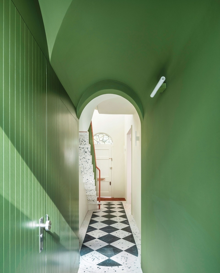
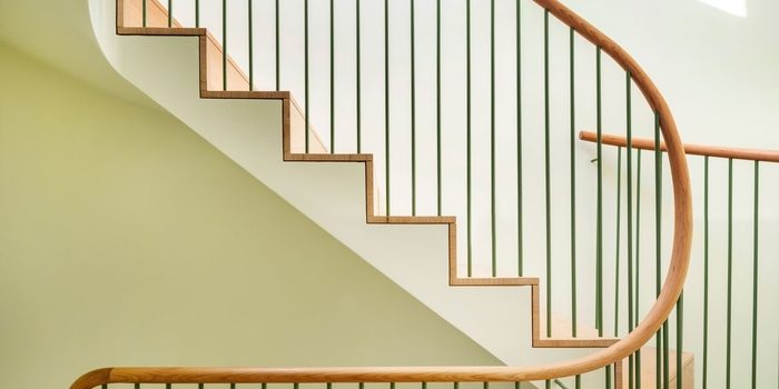
Ultimately, Tyeth and Christian were able to squeeze three levels within about 1,220 square feet—without any notion of tightness. In fact, the entryway is rather airy and luxurious. From the front door, there presents a sweeping view up into the triple height space, with a cantilevered, pill-shaped staircase in the center. “You can look up three stories into the roof space, so you see from the bottom right up to the top of the original house,” Christian says.
The decor of the foyer is as impressive as the scale. In accordance with Georgian tradition, the home features stone stair treads and a checkerboard floor right at the entrance. Made of terrazzo and black marble tiles, the two-tone pattern is at once quirky and elegant. Tyeth and Christian worked with a single craftsman, so the material was relatively affordable and completely customized. “When we do the terrazzo, it’s a bespoke mix, so we choose the background color and then we choose the color of the pebbles,” Christian says.
Cherrywood is the other chief element employed around the house. The natural, reddish brown material is represented in the living room floors, the upper stairs, and the winding banister. “It’s quite a rich contrast to the terrazzo because obviously we didn’t want to make it feel too hard or too cold,” says Christian. “We got the cherry to try to balance out the terrazzo with something much softer and warmer.”
In 1999, Loum-Martin began incorporating bleached wood into her Moroccan-style interiors, which were more typically filled with darker woods. For her own riad in Marrakech, Princess Letizia Ruspoli of Italy, alongside designer Jérôme Vermelin, kept things light and bright, including wood elements like the window frames and the small side table in the corner.
Maïté and Paolo Bulgari tapped local architect Amine Kabbaj and Spanish design duo Gustavo and Pablo Paniagua for their home in the medina. “The ceiling is treated in a very modern approach,” says Loum-Martin. “It’s a classic Moroccan pattern but enlarged and in natural cedar wood. In another house they would’ve painted it in a darker varnish or in patterns.”
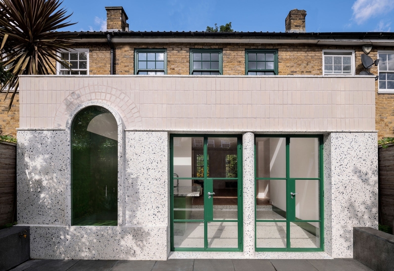

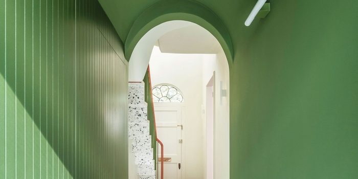
Of course, the use of the color green is bold and striking, so it may come as a surprise that the choice was made on a whim. “It wasn’t part of a grand scheme,” Christian explains. “It’s just what felt right at the time. The green came along fairly late in the day, so there isn’t any complex reason for the green, really.”
Nonetheless, both vivid and pale hues of green make a major impact. Using paint colors Hopper and Acorn Mid from the coincidentally named Little Greene Paint & Paper, Tyeth and Christian covered many of the walls and doors in green. In the tunnel hallway and continuing along the back of the kitchen, an array of fiberboard cupboards appears in the brighter of the two shades.
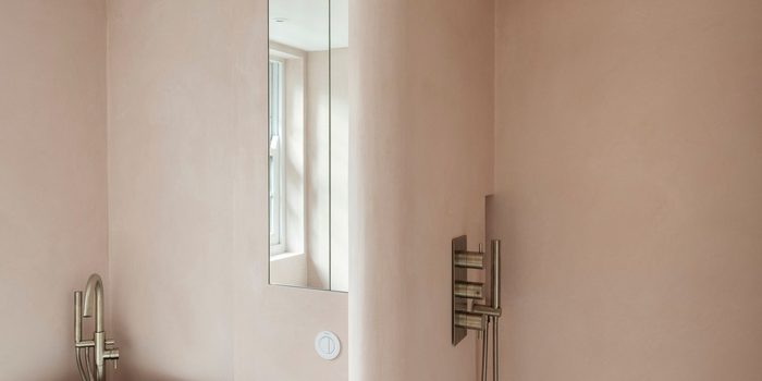
Each bedroom is minimal and directly accessed off the spiral staircase, which Tyeth and Christian thought would flow more effortlessly than multiple corridors. The two bathrooms are constructed from polished plaster, an Italian material the client insisted upon. Though Christian was and remains worried about its durability, it adds a dreamy glamour that seems to permeate the home.
